With the first contest of the Republican presidential primaries under a week away, former President Donald Trump has a large lead over his competitors. Polls show him nearly 50 percent ahead of his closest challenger, Florida Governor Ron DeSantis, according to FiveThirtyEight’s polling average. Statewide polling shows that Trump is 30 percent ahead in the early state of Iowa and over 10 percent ahead in New Hampshire.
But what if we want to know the favorite candidate of Brown University? (It’s Nikki Haley). How about every university, every neighborhood, and everywhere in the country? Campaign finance data gives an answer.
Every three months, the Federal Election Commission (FEC) releases campaign finance data of every candidate, including information about their donors. Specifically, they report “itemized contributions,” defined as contributions coming from individuals who have donated over $200 throughout the election cycle. The fundraising website WinRed—used by most Republican candidates—reports additional donor information depending on if the candidate uses it as a payment processor or political action committee (PAC). While this data excludes a large number of small donors, it contains a sample of around 200,000 Republican primary donors from over 20,000 ZIP Codes. The following maps show the share of donors for a candidate in each ZIP Code, while the table compares the candidates overall.
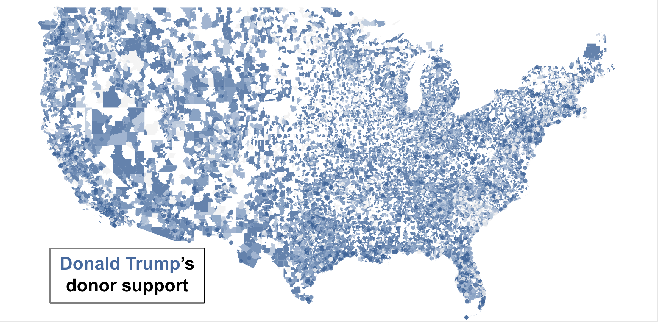
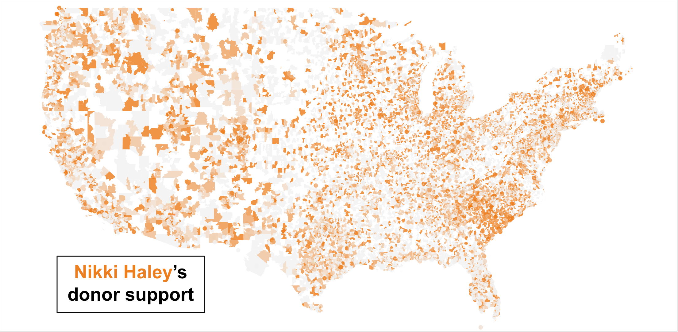
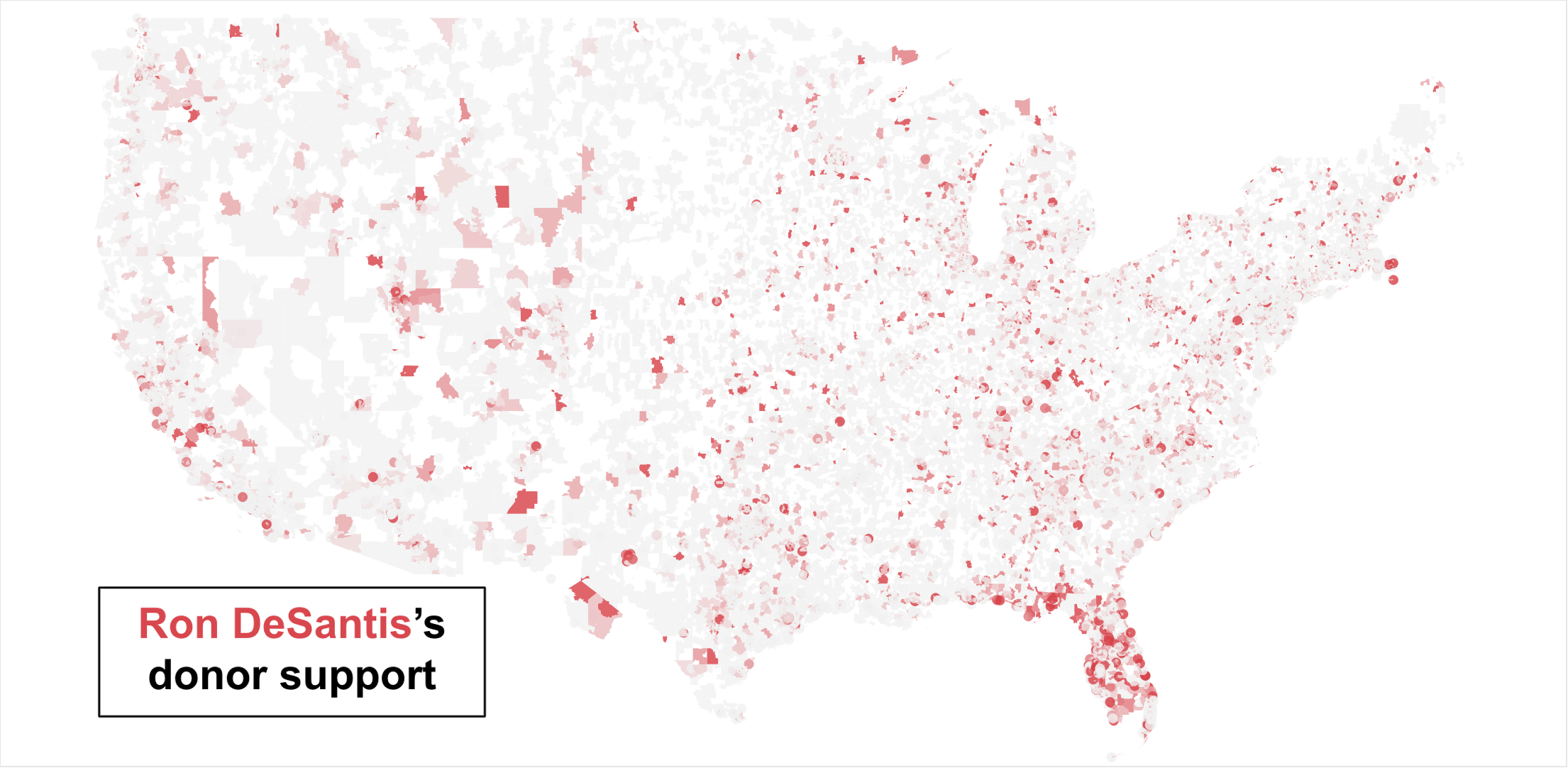
As expected, Trump has significant backing in most ZIP Codes, with support from just over half of the itemized donors. Unlike in the polls, however, former UN Ambassador Nikki Haley is Trump’s main competitor for itemized donors. DeSantis lags far behind both candidates, with less than 10 percent of donors overall. Haley’s success is impressive but not surprising, as she has reported strong fundraising numbers throughout the campaign.
On the other hand, DeSantis’ apparent struggle can be partially explained by an arrangement with WinRed to hide his small donor data. Specifically, he chose to use WinRed instead of a PAC as a payment processor, so support from his small donors went unreported to the FEC and does not show on the map. Moreover, an October analysis from Politico showed that about 75 percent of DeSantis’ campaign money comes from large donors who have given the maximum contribution ($3,300). This is significantly higher than any other candidate and suggests the campaign may be struggling with small donors. Therefore, even if small donor data was included, DeSantis would likely still be in third.
Throughout the map, one general trend holds true: Trump does well in rural areas, while Haley does well in cities. Haley’s coalition is remarkably similar to that of Florida Senator Marco Rubio’s during the 2016 primaries, which is perhaps unsurprising given her endorsement of him seven years ago. Even with this urban coalition, however, Rubio fell short of the Republican nomination. In Iowa, Rubio won the cities of Des Moines, Iowa City, and Cedar Rapids, but only earned a third-place finish statewide with 23 percent of votes. Learning from Rubio’s mistakes, Haley may instead choose to emulate 2012 nominee Mitt Romney, whose message of electability against President Obama expanded his appeal to some rural voters.
While Haley’s strength is limited to urban areas in Iowa, she dominates DeSantis in another early state: South Carolina. Haley was governor of South Carolina from 2011 to 2017 and is polling over 20 percent in the state, according to FiveThirtyEight’s polling average. South Carolina Senator Tim Scott, who recently suspended his campaign, was also the favorite of many ZIP Codes, particularly in downtown Charleston.
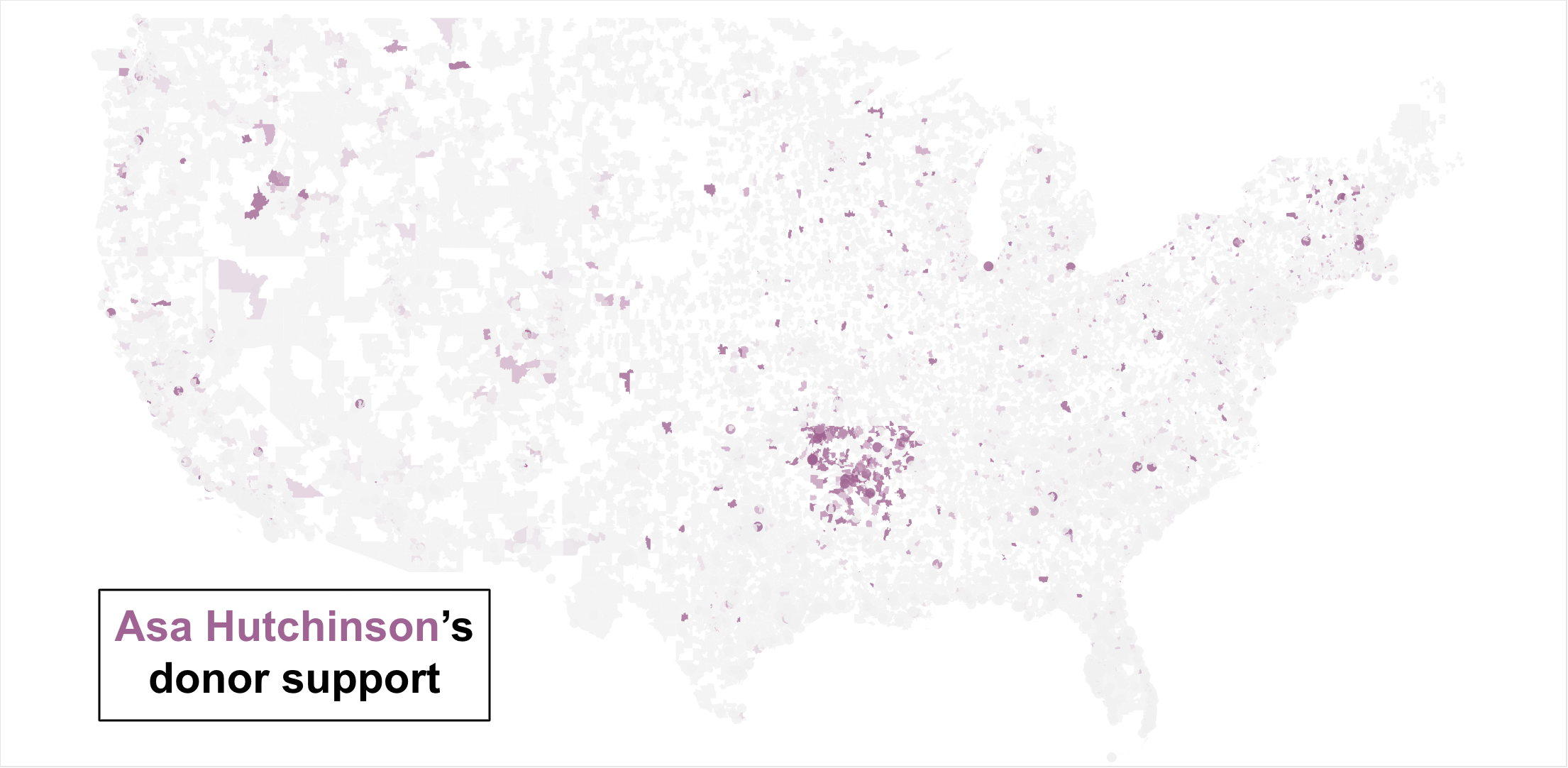
Homestate advantage has been a defining characteristic throughout the primary, not only benefitting Haley, but also Arkansas Governor Asa Hutchinson. Hutchinson has won statewide elections, allowing him to build financial connections that have translated into donations. However, he may still fall short of electoral victories in his home state; North Dakota Governor Doug Burgum, for example, only had 12 percent support in his home state before suspending his campaign.
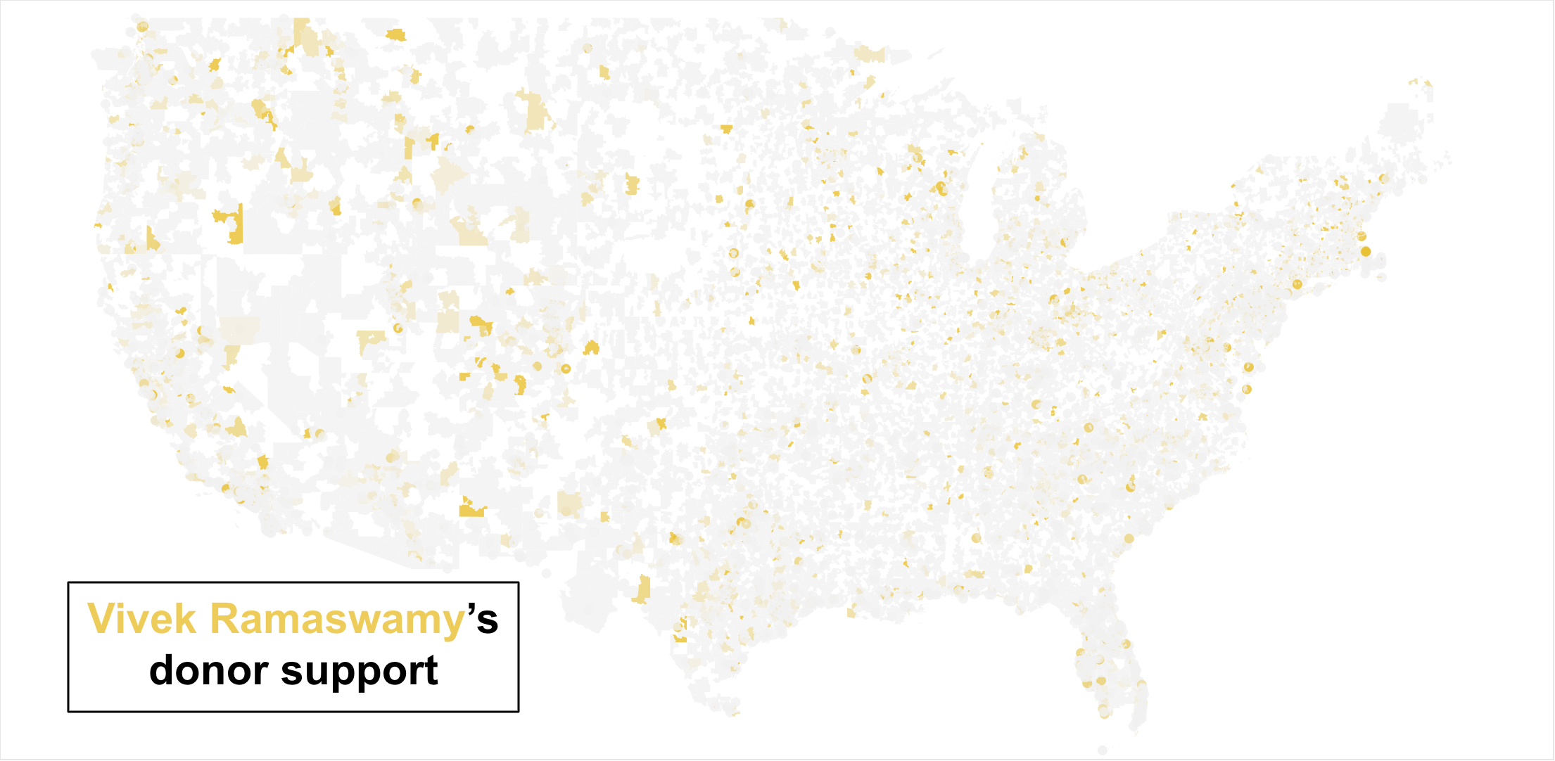
Besides the number of donors to a campaign, the amount of money raised is also indicative of many important outcomes. Candidates with more money can spend more on advertising, staffing, and campaign events. According to Ballotpedia, Trump leads this metric with $60 million raised since the start of his campaign. DeSantis comes in second, while entrepreneur Vivek Ramaswamy is in third thanks to millions in self-funding. Haley’s many small-dollar donors are only enough for $18 million, putting her in fourth place.
While the donor map presents a lot of useful information, it cannot predict election results. Haley’s strong numbers, for example, say much more about her fundraising strategy than her appeal to voters. However, by tracking where their donations come from, we can learn where to locate candidates’ support bases. Crucially, Trump’s strength with donors comes from predominantly rural ZIP Codes, while non-Trump candidates tend to do better in urban areas. If one of Trump’s competitors can break his hold on rural areas, there may be a much more competitive primary than polls currently suggest.
An interactive visualization with all candidates on one map can be found here.
Methodology:
The campaign finance data was downloaded directly from the FEC contribution database. The data was filtered for contributions between January 1, 2023, and September 30, 2023, and the “from unique individuals only” option was selected. After downloading, duplicate donors (donations with identical names and ZIP Codes) were removed using the “remove duplicates” function in Microsoft Excel. This was finally compiled by ZIP Code using the pivot table tool in Google Sheets and visualized with Tableau. The processed data can be found here.